Work > Tchê

Summary:

Re-brand and communication / packaging system update.

Brand Identity

Creative Direction

Packaging

Graphic Design

Photography: @loturley

A visual identity update for a Yerba Matê fueled, complete energy solution. We fine-tuned the wordmark, added a new badge, and built a color coded packaging system around feature and benefit navigation that informs the visual presentation of the brand across all channels. Subtle flashes of texture and abstract form throw a nod to the vibrant mash-up of mid-century design and bright energy of Brazil's modern capital of Brasilia.

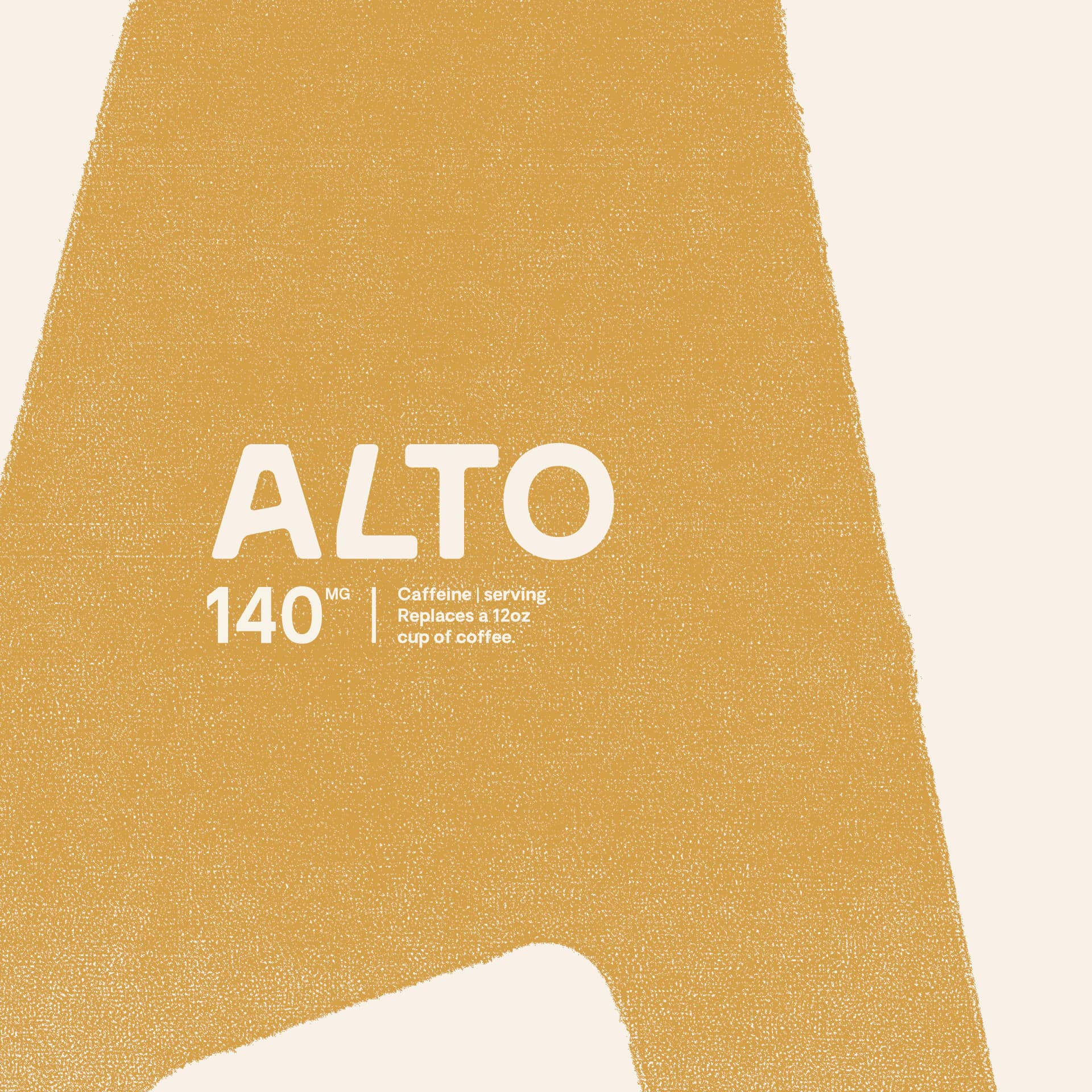
The Alto pouch artwork: a textured mustard shape on cream, labelled "140mg caffeine per serving, replaces a 12oz cup of coffee".
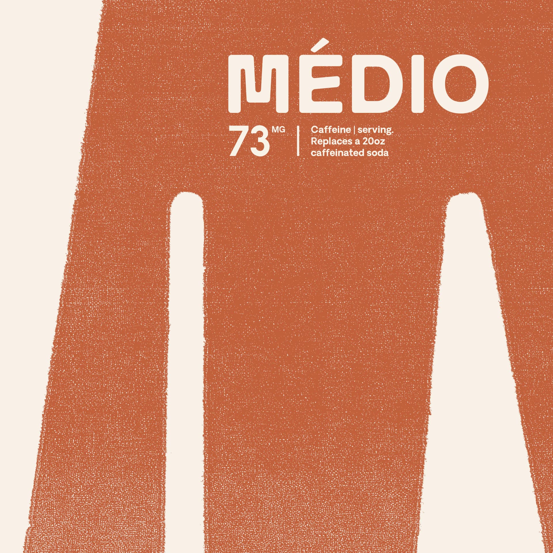
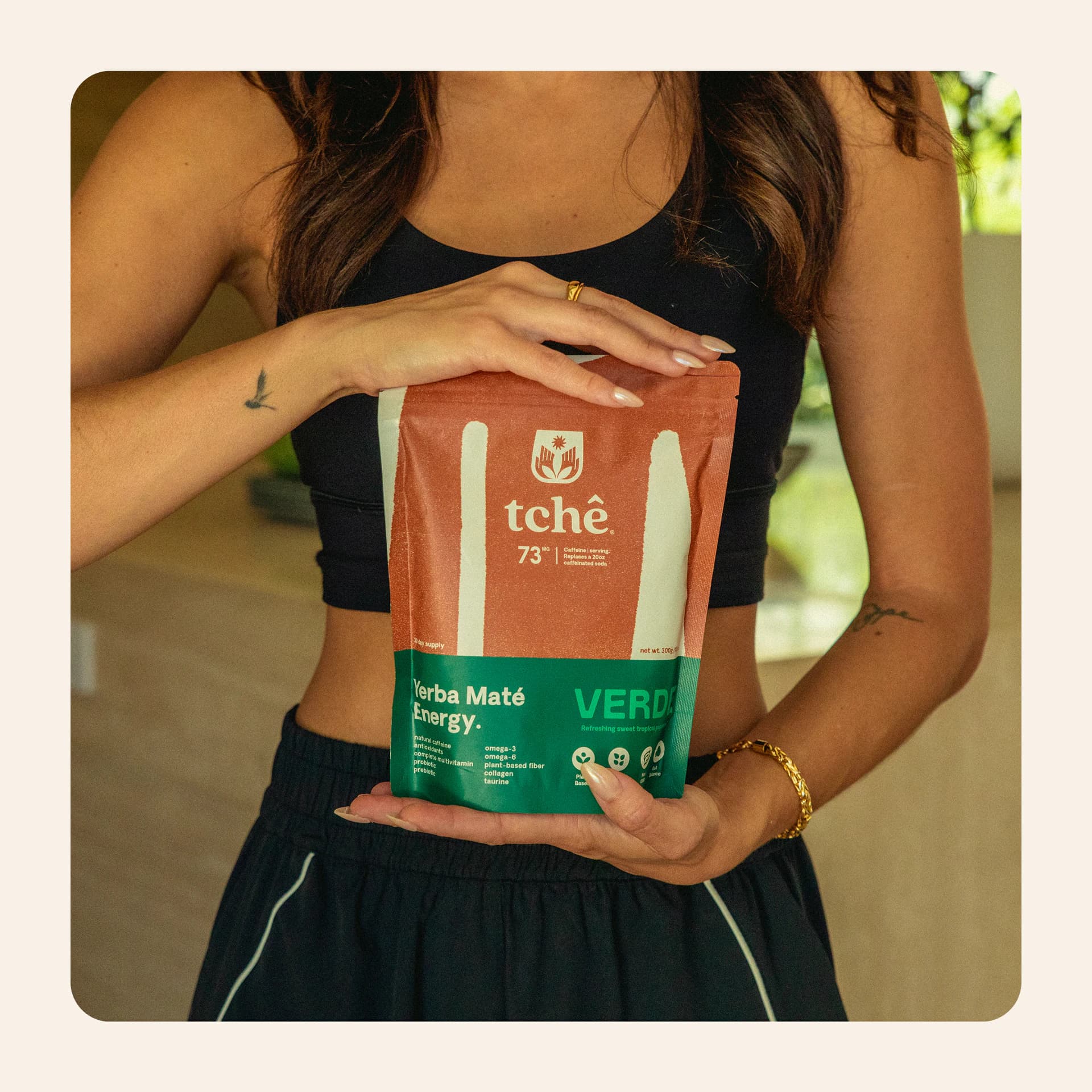
The Médio pouch artwork: a textured rust shape on cream, labelled "73mg caffeine per serving, replaces a 20oz caffeinated soda".
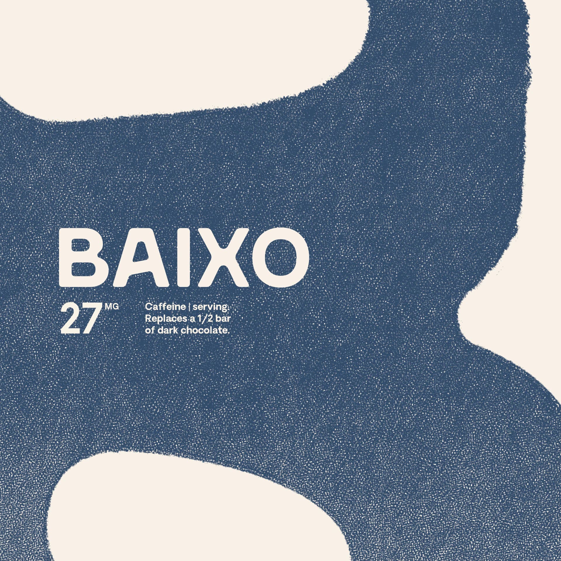
The Baixo pouch artwork: a textured navy shape on cream, labelled "27mg caffeine per serving, replaces half a bar of dark chocolate".
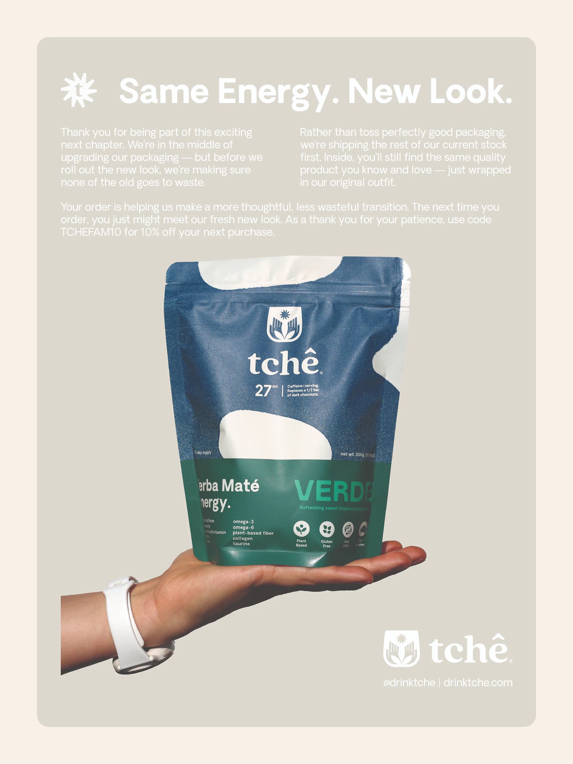
An insert card headed "Same Energy. New Look." explaining the packaging change, above a hand holding a blue and green Tchê pouch.
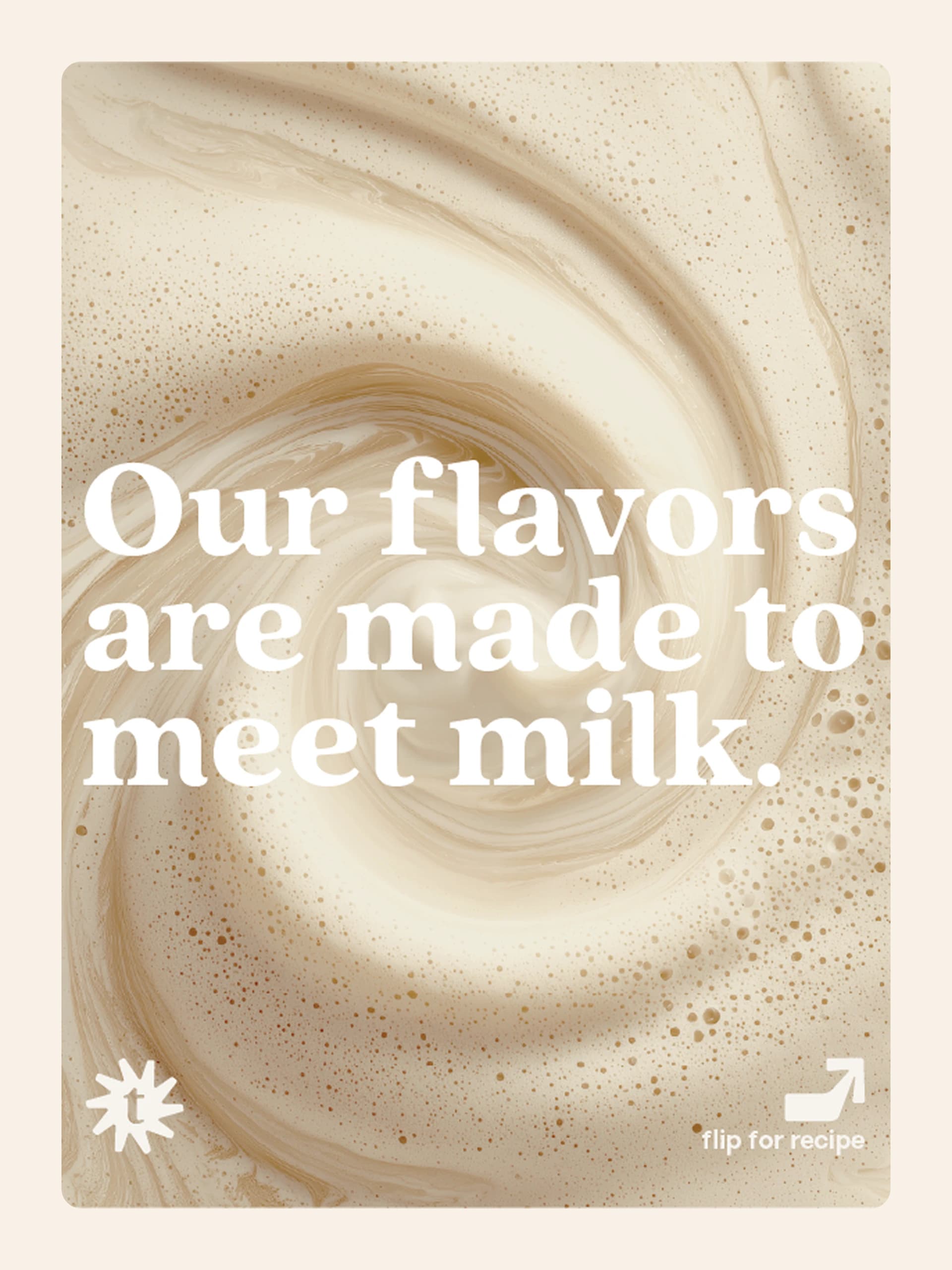
A swirl of frothed milk under the line "Our flavors are made to meet milk.", with a "flip for recipe" arrow.
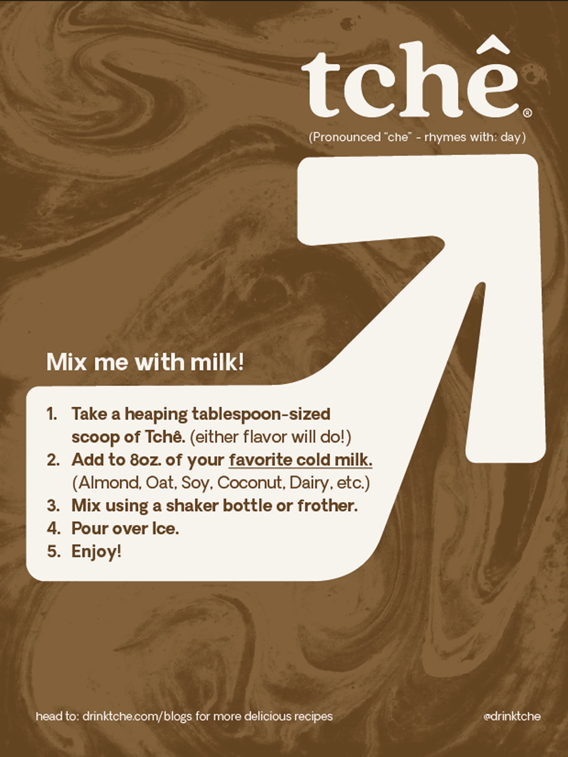
The reverse of the recipe card: five steps for mixing Tchê with milk, set inside a large cream arrow on marbled brown.
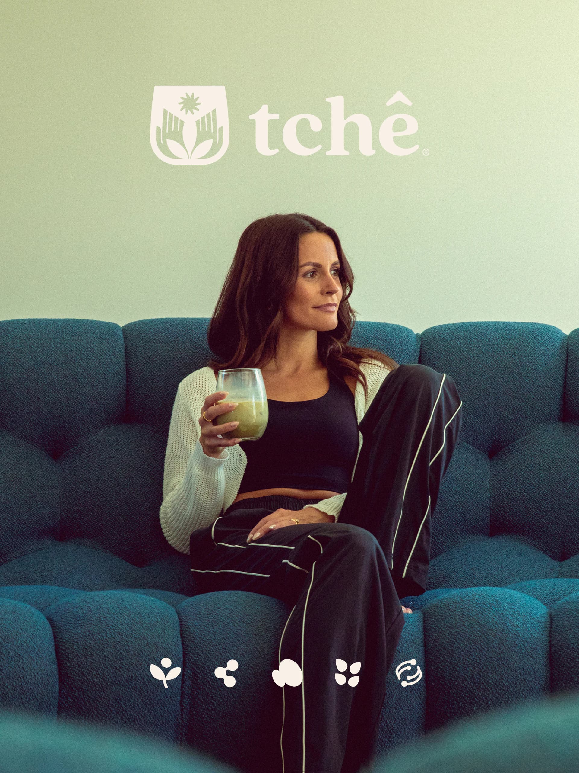
A woman on a teal sofa holding a glass of green Tchê, beneath the Tchê logo and a row of small benefit icons.
A woman holding a rust-orange Tchê pouch against her waist.
A beach at dusk with birds at the waterline, overlaid with the Tchê sun mark and "Complete energy from the ground up."